The problem
Families considering a multi-family office do not necessarily know the term. They arrive with questions about preserving wealth across generations. Opening with a list of services asks them to understand the category before recognising why it matters.
Four specialist offerings also needed to read as distinct services. To someone comparing firms for the first time, advisory, structuring, philanthropy and reporting can otherwise sound like variations of the same promise.
Constraints that shaped the work
Discretion is central to this business. Named client logos, public testimonials and urgency-led conversion patterns are a poor fit for families who value privacy.
The website also serves existing clients who simply need their reporting. Their routine task should not compete with the prospective client's path through the firm and its services.
Start with the family's question
The narrative opens with the concern about generational wealth, then explains the multi-family office model. That puts recognition before terminology.
Each service follows a shared structure: what it covers, which families need it, how it works and what the first conversation involves. A predictable template makes comparison easier, even when the underlying services are complex.
Separate explanation from access
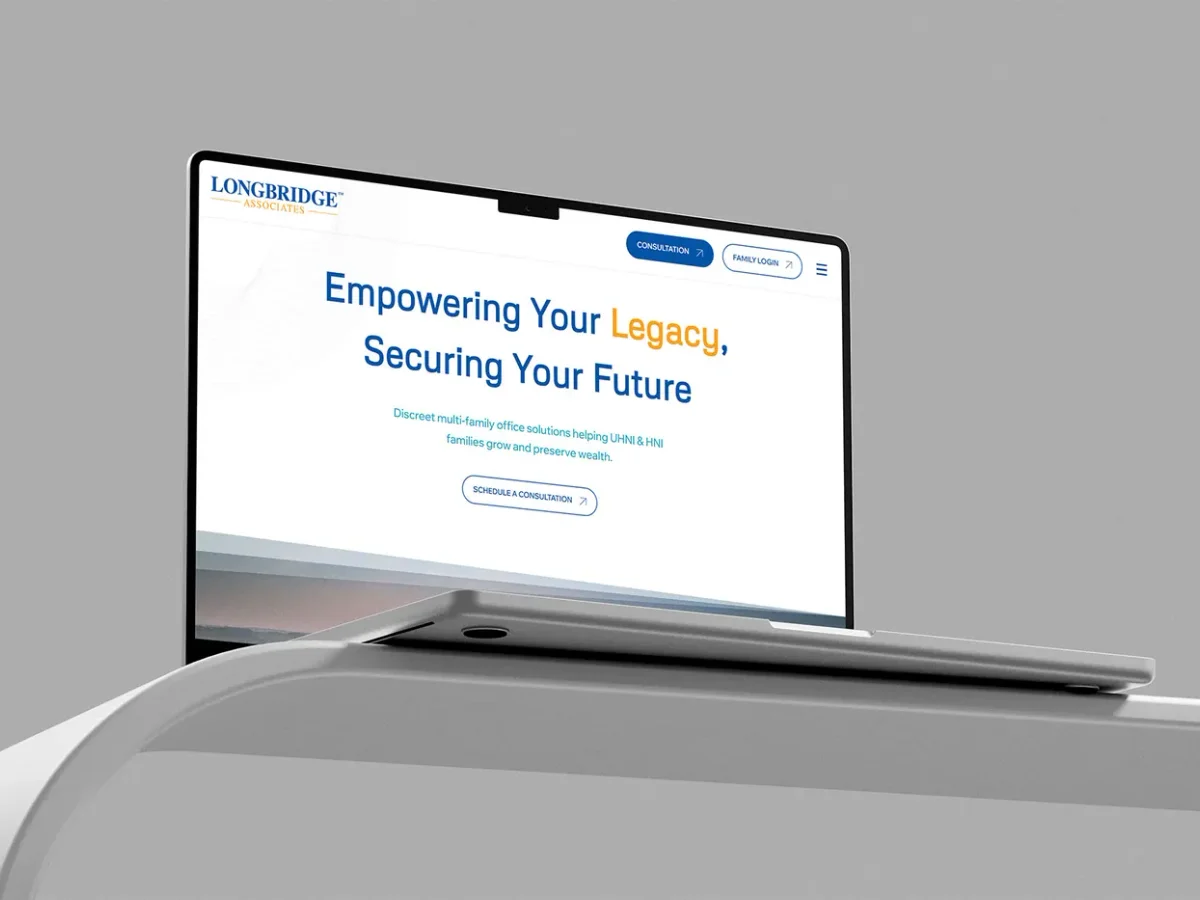
Family sign-in is a persistent, quiet entry point. Prospective families can explore the firm without navigating around an application they cannot enter, while existing clients have a direct path to their own information.
This gives a routine action less visual prominence without making it harder to find.
Make reporting part of the proof
The reporting views organise global holdings around a clear primary figure, with currency and jurisdiction visible. Drill-down preserves context so a reader can move into detail without losing their place.
The visual direction uses restrained typography and space. The insights library supports credibility where public client endorsements would be inappropriate.
What I built
My documented scope includes positioning, UX, UI and the responsive front-end build. It also covers service templates, reporting interface design, the insights library and the consultation flow.
Outcome and further questions
The four services now have separate explanations, and existing families reach their reporting through a distinct entry point. The client describes a clearer, more professional digital presence.
No conversion benchmark is published. A useful next evaluation would test whether prospective families can distinguish the offerings and explain the next step in their own words.